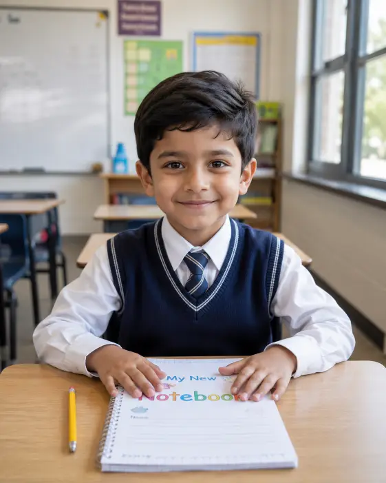
This one makes a simple, warm school portrait. A young boy at his desk, hands resting on a notebook, looking up at the camera with a small nervous smile.
I keep coming back to prompts like this because they are hard to get wrong. Everything is stated clearly, nothing asks for a strange pose or a difficult effect, so the image usually lands close to what you pictured.
It suits anyone making school themed content, back to school graphics, a stock style photo for a parenting blog, or just a nostalgic image for its own sake.
What this prompt is actually asking for
The subject comes first, and the age matters more than people expect. Saying a young boy around seven sets the face shape, the size of his head relative to the desk, and the general softness of the features. Leave the age out and you often get a face that reads too old for a classroom.
The posture line does a lot of quiet work. Sitting upright with both hands on a notebook gives the picture a still, composed feel, and it also solves the hands problem, which is the single most common thing that goes wrong in AI photos of people. Hands flat on a surface are far easier to render than hands floating in the air.
The sharpened pencil beside the notebook is a tiny prop, but tiny props are what make a photo feel real. Without it the desk looks bare and the whole thing drifts toward something obviously staged.
The expression is set as a shy smile with his eyes up at the camera. That pairing is the emotional core here. Looking up gives you a slight tilt of the head plus eye contact, and shy keeps the smile from opening into a wide grin that would feel like a catalogue photo.
Clothing is pinned down to three pieces: a white shirt, a striped tie, a navy sweater vest. That level of detail earns its place. If you only write school uniform, results swing wildly between runs, and you end up with a blazer, a jumper, a polo, whatever the tool decides a uniform means that day.
The camera and lighting choices
Desk height is the key instruction in the whole prompt. It puts the camera low, roughly level with the desktop, so you are seeing him from a child’s own eye line rather than from an adult standing over him.
The slight downward angle then softens that. It keeps some of the desk surface visible in frame and adds a gentle sense of looking at him rather than staring straight across. Drop both instructions and most tools default to a flat adult eye level shot, which is fine but far more ordinary.
Lighting is soft daylight through big windows on the right. Soft means no harsh shadows and no bright hotspots on the face, the kind of light you get on an overcast morning. Naming the direction matters because it puts shadow on one side of his face and gives the image some shape instead of a flat, evenly lit look.
The background is blurred on purpose. A whiteboard and colorful wall charts say classroom without competing with the face, and the blur is what makes it look like it came from a real camera with a proper lens. In plain words, blurring the background is the trick that separates a photograph from a snapshot.
The style line, clean bright school documentary with soft natural colors, sets the color mood. Documentary here means honest and unposed rather than glossy and retouched, so skin keeps its texture and colors stay close to what an eye would actually see.
The tall four by five rectangle fills an Instagram feed post. It also frames a seated subject well, since you get the desk, the torso and a little headroom with no wasted space on the sides.
What you will get
Expect a well lit classroom photo, the boy centered or slightly off center, the desk across the lower part of the frame, and a soft wash of light coming in from one side.
The parts that hold steady across runs are the clothing, the pose, the lighting direction, and the overall mood. Those are specified tightly enough that most images will broadly agree with each other.
The parts that move are the face, the exact background details, and the desk itself. Every run hands you a different boy. The whiteboard might carry writing, or be blank, or turn into a chalkboard, and desks shift between a modern plastic school table and an older wooden one.
The tie is the fiddliest piece. Stripes on a small object at that scale sometimes come out uneven or blend into the shirt, and occasionally the knot sits crooked. I usually run this a few times and pick the cleanest result rather than fighting it with more wording.
Text is the other weak spot. If the whiteboard ends up with writing on it, that writing will almost certainly be gibberish. The blur hides most of it, but check before you use the image anywhere public.
Ways to change it
For a girl instead, rewrite the subject line to read a young girl around seven with her hair in two braids, and swap the sweater vest for a navy pinafore over a white shirt.
For a warmer, more nostalgic feel, replace the lighting line with late afternoon sunlight coming through the windows on the right, casting a warm glow across the desk. That one change moves the picture from crisp morning to golden hour.
To make it read as an older photo, swap the style line for soft film photography look with slightly faded colors and visible grain. The result feels pulled out of a family album.
If you want other children in the shot, add and a few other pupils seated at desks behind him, out of focus. Keep out of focus in there, because background children pull attention and their faces often come out badly.
For other platforms, nine by sixteen gives you a vertical Stories or Reels frame, one by one gives you a square, and sixteen by nine works as a blog header, though at that width you should also change the camera line to a wider shot so the sides do not sit empty.
A few things worth knowing
Prompts involving children hit safety filters more often than adult portraits, even when the content is completely ordinary. If this one gets blocked, the fix is usually to cut rather than add.
Try trimming it to the essentials: the boy, the desk, the notebook, the uniform, the window light. Long physical descriptions of a child are what tends to trip the filters, so the less time the prompt spends on the person, the smoother it tends to go.
Keep the words school and classroom in there. They give the image a plain, clear context that helps everything else read as what it is meant to be.
I would not push this one much further than it already goes. It works because it is specific about the setting and the light, and restrained about everything else.