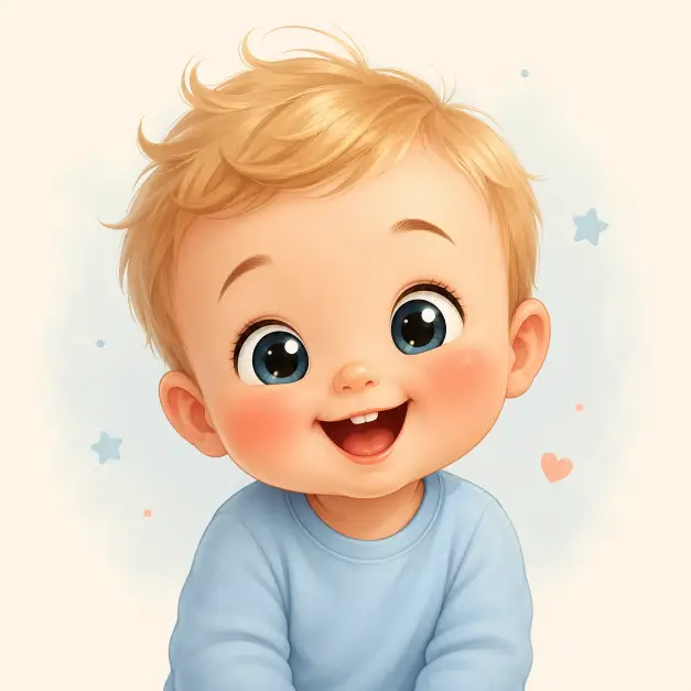
This one makes a single cartoon baby, drawn big headed and round faced, sitting on a background so pale it almost reads as white. It is a character illustration, not a photo, so nothing in it pretends to be real.
I use prompts like this for sticker sets, nursery printables, greeting card art, and simple mascot characters. It also works as a base when I want a friendly face that does not look unsettling, which is harder with baby characters than people expect.
The wording is long, but almost every line is doing one specific job. That is why the results stay fairly consistent from run to run.
What this prompt is actually asking for
The first instruction sets the whole frame: a drawing, a cute cartoon baby, a very light pastel background. Saying drawing up front keeps the output away from photo territory. Without that word I sometimes get a glossy 3D render or a half realistic child, which is a completely different mood.
Very light pastel background does more than pick a color. It keeps the backdrop empty and low contrast so the character is the only thing worth looking at. It also makes the image easy to cut out later if I want the baby on its own.
Large rounded head with soft proportions and a small body is the chibi instruction. Chibi just means a character drawn with a head far too big for the body, usually around a third of the total height. That one ratio is what makes a character read as cute instead of reading as a small adult.
Soft proportions matters alongside it. It pushes the drawing away from sharp jawlines, pointed chins, and angular shoulders. Everything curves.
Fair skin with a warm glow sets the tone and the temperature at the same time. Warm glow nudges the shading toward peach and away from grey, which is the difference between a baby that looks healthy and one that looks slightly ill.
Round cheeks with pronounced rosy blush is the detail I would keep even if I stripped out everything else. Blush on the cheeks is a shortcut the eye reads instantly as young and cheerful.
The eyes carry most of it
Big expressive eyes with large dark pupils are the core of the cuteness. Large pupils relative to the eye read as young and non threatening, which is why nearly every cartoon animal ever drawn has them.
Glossy highlights are the small white dots sitting on the eye. They suggest a wet surface catching light, and without them the eyes go flat very fast.
Subtle gradients in the eye means the color fades from darker at the top to lighter at the bottom rather than sitting as one solid block. It is a small thing, but it makes the eye look painted instead of filled in.
Small gently curved eyebrows keep the expression friendly. Straight or angled brows would push toward serious or annoyed even with the same smile underneath.
The open mouth with a hint of teeth gives a joyful expression rather than a polite one. Hint of teeth is useful wording, because a full toothy grin on a baby often comes out strange.
Hair, clothing, and the painted finish
Short, soft, slightly tousled hair in light golden blond keeps the silhouette simple. The few curved strands at the top are the bit that adds personality, that little flick of hair that reads as playful.
Gentle shading on the hair means it will not be one flat blond shape. There should be a darker tone underneath and a lighter one where the light lands.
The long sleeve shirt in muted pastel blue is deliberately plain. Smooth fabric shading and minimal detail tells the drawing to skip patterns, logos, buttons, and heavy folds, so the clothing never competes with the face.
Clean, polished, and digitally painted covers the finish. Digitally painted means soft edges and blended color rather than hard blocks of shading with thick outlines around them.
Soft gradients, smooth blending, and rounded shapes all push the same idea from slightly different angles. Repeating an instruction in different words is not wasted effort, it genuinely holds the style steady.
Aspect ratio 1:1 gives a square. That suits stickers, profile images, and thumbnails, and it centers the character neatly.
What you will get
Expect a single baby, centered, framed from roughly the chest up, smiling straight at the viewer on a near white pastel field.
The parts that stay stable are the oversized head, the blush, the blond hair, the blue shirt, and the smile. Those are stated plainly enough that they rarely drift.
The parts that move around are the framing and the pose. Sometimes I get head and shoulders, sometimes a small seated body with hands showing. Hands are where this kind of drawing struggles most, so the tighter crop is usually the better outcome.
Eye color also floats, since the prompt never names one. I have had blue, brown, and a soft grey green from the exact same wording.
Ways to change it
For different hair, replace light golden blond with soft dark brown with a slight wave at the front, or with black hair with a small tuft standing up at the crown.
To shift the mood from joyful to sleepy, change the mouth line to a small closed smile with the eyes half open and relaxed, and change the background to a warm cream background.
For a full body version, add the character is shown full body, standing, with short chubby legs and bare feet, centered in frame. That shows off the chibi shape properly, though it also raises the odds of odd hands and feet.
If I want it for a story or a Reel, I change the aspect ratio line to 9:16 and add plenty of empty background above the head so there is room for text later.
For a seasonal version, swap the shirt for a soft pastel blue knitted sweater with a small cable texture and add a tiny scarf around the neck.
A few things worth knowing
Prompts describing babies and small children sometimes trip safety filters even when nothing about them is a problem. If it gets blocked, replacing the word baby with toddler character or cartoon child usually clears it without changing the result much.
Very light pastel background is not the same as a transparent one. If I need transparency for stickers, I still have to cut the background out afterward.
The word cute is doing real work here. Take it out and the output drifts toward a neutral character illustration, which is not the same thing at all.
I usually run this four or five times and keep the one with the best hands and framing. Everything else lands close enough that picking a favorite takes about a minute.