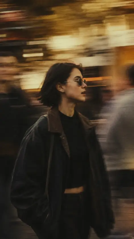
This one makes a photo that looks like somebody was standing on a busy footpath and swung the camera sideways to follow a woman as she walked past. She stays mostly sharp. Everything behind her turns into long streaks of gold and brown.
I keep coming back to it because it does not look posed. Most AI portraits look like the person stopped and waited for the shot. This one looks caught by accident, which is a much harder thing to fake.
It suits anyone who wants a moody profile shot with a film feel, and the tall framing means it drops straight onto a phone screen without cropping.
What this prompt is actually asking for
The subject is a young woman walking through a crowd. She is the anchor, and almost everything else in the prompt describes how she is photographed rather than what she looks like. That is on purpose. Leaving her face loosely described gives you a different person on every run without changing the mood.
Captured in profile means the camera sees the side of her face instead of the front. Profile shots read as observational. You are watching her go by, not being looked at, and that small difference is most of what separates a street photo from a portrait.
Mid-stride with her head turned to the side is doing more work than it looks like. Mid-stride means one leg is forward and her weight is shifting, so the body reads as moving even though the frame is frozen. Without that instruction you often get someone standing still with blur behind them, and the mismatch gives the whole thing away instantly.
The dark oversized jacket over a black top keeps her shape simple and heavy. Dark clothing against a bright smeared background separates cleanly, so she does not dissolve into the streaks. Put her in something pale and patterned and the picture goes mushy in the middle.
The small round tinted sunglasses are the one styling detail with any personality in it. They hide her eyes, which stops the image drifting back into portrait territory. Tinted rather than solid black means you still get a hint of shape behind the lens instead of two flat discs.
Short dark hair tucked behind one ear is a quiet detail that helps the profile stay readable. Loose hair blowing across the face fights the blur and muddies the edge of her jaw.
The camera and lighting choices
The background is really the subject here. Those horizontal streaks of gold, cream and dark brown come from panning, which is when the photographer moves the camera sideways at roughly the same speed as the person walking while the shutter is still open.
Slow shutter speed means the camera collects light for longer, so anything moving relative to it smears. Because the camera is tracking her, she stays reasonably sharp while the street drags into lines behind her.
That is also why the prompt asks for unrecognizable blurred figures. It is telling the generator not to bother rendering a crowd of faces. Background faces steal attention, and they tend to come out warped anyway, so smearing them is both a style choice and a repair.
The 50mm lens matters more than most people expect. Fifty millimeters sits close to how your own eye frames a scene, so proportions look normal, with no wide-angle stretch on her face and no long-lens flattening.
Warm muted color grading means the colors lean amber and brown but stay soft instead of loud. Low contrast keeps the shadows from crushing into pure black, and that lifted, slightly washed shadow is the main reason it reads as film rather than digital.
Heavy grain adds the fine speckled texture that old film stock has. Grain is one of the quickest ways to stop an image looking too clean, and it usefully hides small mistakes in the blur.
The 9:16 aspect ratio gives you a tall vertical frame. It fits phone screens, Stories and Reels, and it squeezes the composition into a narrow column, which makes the horizontal smear feel even wider by comparison.
What you will get
Expect a warm brown and gold image with a dark figure moving through streaked light. The mood holds up well across runs. The details do not.
The reliable parts are the color palette, the vertical framing, the heavy background smear and the general silhouette of a dark jacket in motion. Those show up almost every time.
The parts that wander are her face, her apparent age, which direction she walks, how much of her body sits in frame, and how sharp she actually comes out. Sometimes you get her from the knees up, sometimes the full figure with room above her head.
The most common failure is that the blur creeps onto her as well. Some runs hand you a woman almost as smeared as the street behind her, which kills the effect completely. Generating this one a few times before you get a keeper is normal, not a sign you did something wrong.
Feet and hands are the other weak spot. Mid-stride poses put legs in odd positions, so check the trailing ankle and the swinging hand before you use the picture anywhere public.
Ways to change it
To cool the whole thing down, replace the color line with cool blue-grey and silver streaks with faint neon reflections. It stops being a warm afternoon and turns into an evening outside a station.
To fight the blur bleeding onto her, add crisp focus on the subject with only her jacket edges softened by movement. That pushes the sharpness back where it belongs without weakening the background.
For a different subject entirely, swap her for a man in a long grey coat carrying a leather bag, and leave every camera instruction untouched. The technique carries over cleanly to almost any walking figure.
If you want more chaos, change the background line to dense streaks of moving bodies and shopfront light, which fills the empty space with texture instead of open smear.
For other platforms, use 4:5 for an Instagram feed post, 1:1 for a square grid tile, or 16:9 if you want it as a blog header or a wide banner.
A few things worth knowing
Panning prompts sit among the fussier ones, so a low hit rate is part of the deal. I usually run it four or five times and keep one.
If your results come back too clean, push the wording harder rather than adding new details. Putting extreme or long exposure in front of the blur description tends to move the needle more than another sentence about her jacket.
Nothing here should upset a safety filter. No minors, no brand names, nothing suggestive, so it is an easy one to keep reusing and reshaping.
One last thing about grain. If the output looks noisy instead of filmic, drop heavy grain to light grain, because some generators read heavy as digital noise and add ugly speckling in the shadows.
I think the appeal of this prompt is that it hides the subject a little. You get a person you cannot quite see, moving through a place you cannot quite read, and that gap is what makes people stop scrolling.