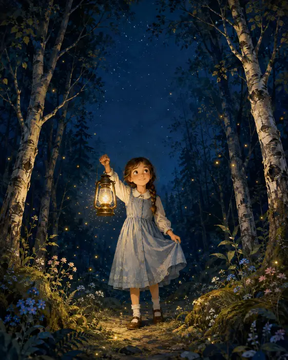
This one makes a book cover, not just a picture. That difference matters, because the whole thing is built around leaving empty space at the top where a title would sit.
I reach for it when I want something soft and warm rather than spooky. A dark forest at night could go either way, and most of the wording here is quietly pushing it toward safe and gentle.
It suits anyone making a mock cover, a bedtime story image, a nursery print, or just a pretty illustration to post somewhere. You need no drawing skill on your end.
What this prompt is actually asking for
The subject is a young girl standing alone. That word alone is doing real work. Without it you often get a second child or an animal companion wandering into the frame, and the quiet feeling goes away.
Her right hand holds up a brass lantern, her left hand holds the hem of her dress. Naming both hands separately is the useful trick. If you describe only one hand, the other tends to end up limp or hidden behind her, and hands are the part most likely to come out wrong.
Holding the lantern up rather than down also decides where the light comes from, which changes the entire image. More on that below.
The clothing is spelled out down to the shoes: a pale blue button-front pinafore, a white collar, white ankle socks, brown leather buckle shoes. That level of detail is not fussiness. Vague clothing wording gives you a different outfit every run, and if you want the same character across several images, the outfit is what holds her together.
The single loose braid over one shoulder does the same job for her hair. It is a specific, repeatable shape rather than a general idea.
The framing and the light
Full body means head to shoes stay inside the frame, so you actually see the dress, the socks, and the shoes instead of losing them off the bottom edge.
The slightly low eye-level angle puts the viewer just below her eye height. It makes her look a little taller and makes the trees loom more, which is what gives the cover its sense of scale.
Then the birch trunks curve inward above her. That is a framing habit borrowed from real illustration. The trees act like a natural arch that pulls your eye toward the center, and the gap they leave becomes the open sky for a title.
If you drop the line about open sky, the branches usually close over the top and the title space disappears. That single phrase is the most load bearing part of the whole prompt for cover use.
The lantern casting a warm amber pool on the mossy ground tells the illustration where its brightest point sits. Light spilling downward and outward from her hand means her face and dress catch a warm glow while everything behind her stays cool and dark.
Fireflies and tiny gold sparkles are there for texture. They fill the dark middle distance so the background does not read as a flat black wall.
The small blue and pink wildflowers near her feet do something similar at the bottom. They give the eye somewhere soft to land and stop the lower half from feeling empty.
The style and color choices
Soft painterly digital illustration with visible brush texture is the instruction keeping this from looking like a rendered 3D scene. Painterly means the edges stay a little loose, the way a hand painted picture looks when you get close to it.
Visible brush texture pushes that further. It asks for strokes you can actually see rather than a smooth airbrushed finish.
Deep navy and teal warmed by lantern gold is a two temperature palette. Cool colors everywhere, one warm source in the middle. That contrast is most of the reason the image feels cozy instead of frightening.
The closing line about mood being calm, safe, and quietly magical is a nudge, not a command. It softens her expression and keeps the forest from turning menacing.
Aspect ratio 4:5 gives a tall upright frame. It suits a book cover shape, and it also happens to be the tallest ratio that fits an Instagram feed post without cropping.
What you will get
Expect a centered girl, a glowing lantern, and a dark blue forest with visible light scatter through the trees. The overall composition stays fairly reliable run to run, because the prompt pins down the pose, the framing, and the light source.
What varies is her face. Her age reads anywhere from about six to about ten, and the features shift every time. If you need the same child twice, plan on generating several and picking the closest match, or feed a reference image alongside the text.
The lantern shape wanders too. Sometimes you get a proper hurricane lantern with a glass chimney, sometimes something closer to a small oil lamp with no frame at all.
Hands are the usual weak point. The hand gripping the dress hem goes strange more often than the one holding the lantern, so check it closely before you commit to a result.
Fireflies come out inconsistent as well. Some runs give you a few tasteful glowing dots, others give you a heavy scatter that reads more like falling snow.
Ways to change it
For a warmer autumn version, replace the birch trunks with tall pine trunks and mist drifting between them, then change the palette line to deep green and brown warmed by lantern gold.
For a winter cover, swap the mossy ground for a light dusting of snow on the forest floor and change the flowers to bare frosted twigs near her feet. Keep the lantern gold, since it reads even stronger against cold blue snow.
To make her older, change young girl to a girl of about twelve and swap the pinafore for a wool coat over a plain dress. The braid still works fine.
If you want a phone wallpaper instead of a cover, change the ratio line to aspect ratio 9:16 and add extra vertical space above her head for the title. The taller frame gives the trees more room to arch.
For a square post, use aspect ratio 1:1, but expect to lose some of the title gap, since the trees close in faster in a square.
A few things worth knowing
A child alone at night in a dark forest sometimes trips content filters even though nothing about the scene is unsafe. If it gets blocked, the words most likely causing it are alone and deep night. Try standing in a moonlit forest clearing and keep everything else as is.
The open sky at the top only holds if you ask for it plainly. If your result fills the top with branches, add a separate sentence at the end reading clear open sky visible at the top of the frame with no branches crossing it.
Putting real text on the cover is a different problem. Most image generators still handle lettering badly, so I leave the title space blank and add the words afterward in any basic editor.
I keep coming back to this one because the light does most of the work. You can change almost anything else and it still holds together, as long as the lantern stays the brightest thing in the frame.