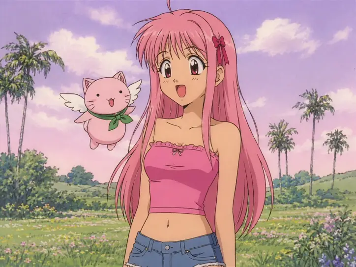
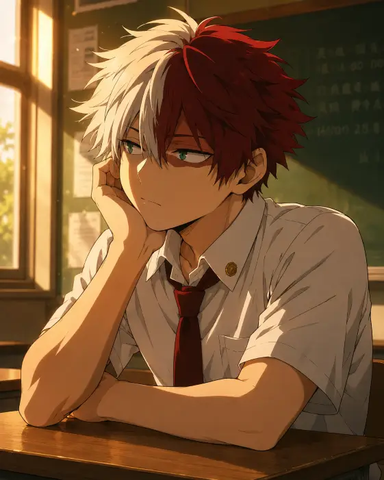
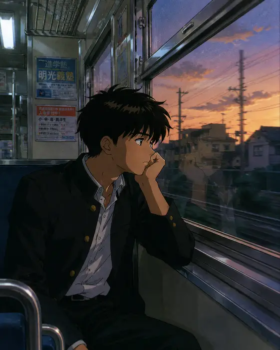
This one makes a still frame that looks like it was paused off an old anime tape. Faded colors, thick outlines, a slightly grainy softness, and a character caught mid sentence rather than posing.
I use prompts like this for nostalgia posts, profile pictures, and thumbnails where a clean modern render would feel too polished. The whole point is that it should look a little worn.
It is a character illustration prompt, not a photo prompt, so most of the wording is doing art direction instead of camera work. That changes what you can tweak later, and I will get to that.
What this prompt is actually asking for
The subject line does a lot of quiet work. Asking for a cheerful teenage girl with a surprised, happy expression and her mouth open in mid speech gives the image a moment instead of a pose. Without that phrase you tend to get a closed mouth and a neutral face, which reads as a character sheet rather than a scene.
Mid speech is the key part. It tells the model to draw the mouth in an in-between shape rather than a clean smile, and that single detail is what sells the idea that this is a frame pulled out of a moving scene.
Long straight pink hair with a small ribbon clip is a shape instruction more than a color one. Straight hair keeps the silhouette simple and flat, which suits the drawing style, and the ribbon clip gives the eye a small point of interest near the face.
Wide round eyes points the style toward the older end of anime design. Modern anime eyes are often narrower and more detailed. Round eyes with a big highlight are a shorthand for the era this prompt is chasing.
The clothing line is period costume. Strapless crop tops and low waisted denim were everywhere in early 2000s design, so naming them tells the model which decade to draw from. If you swap in a school uniform or a hoodie, the picture still works but it stops feeling like a specific year.
The small round pink cat creature with tiny white wings and a green scarf is the mascot slot. Almost every show from that period had one, and including it makes the image read as a scene from a series rather than a standalone drawing. It is also the most unpredictable part of the prompt, which I will come back to.
The sunlit meadow with soft palm shaped trees keeps the background simple. Palm shaped is a useful word here because it asks for a loose fan silhouette instead of a detailed tree, and detailed trees would fight with the flat drawing style.
The framing and camera choices
Eye level means the imaginary camera sits at the same height as her face. It makes her feel like someone standing in front of you and talking, rather than someone being looked down on or looked up at. For a friendly, chatty character this is almost always the right height.
Framing from the hips up is a medium shot. You get the outfit, the arms, and enough background to place her somewhere, without dropping into full body where the face gets small. It also conveniently avoids drawing feet, which tends to be where these images fall apart.
The 4:3 aspect ratio is not decorative. Older anime was made for boxy television screens, so a squarish frame is part of the memory this prompt is reaching for. Run the same wording at 16:9 and it immediately starts to feel modern, even with everything else unchanged.
Lighting and color
Flat daylight is the opposite of dramatic lighting. There is no strong direction, no deep shadow, no glow around the edges. It sounds boring written down, but flat light is exactly what hand painted animation used, because complex shadows were expensive to draw frame after frame.
The pale pink and lavender sky handles the mood on its own. Those two colors sitting next to each other produce a soft, slightly unreal daytime that feels warm without being sunny.
A washed out pastel palette is the aging instruction. It asks for colors that look slightly faded, the way film and old video lost saturation over time. Take this phrase out and the colors come back bright and clean, and the retro feeling goes with them.
The style words carrying the most weight
Visible line art asks for outlines you can actually see around shapes, including inside the drawing, not just at the edges. This is the single biggest difference between hand drawn animation and a smooth digital render.
Flat cel shading means shadows arrive as solid shapes with hard edges rather than soft gradients. Skin gets one flat tone plus one flat shadow tone, and nothing blends. It looks simple, and simple is the goal.
Old school hand drawn is a general nudge, and it works best because the more specific words around it are backing it up. On its own it is vague. Sitting next to visible line art and flat cel shading, it lands.
What you will get
The reliable parts are the pose, the framing, the color mood, and the flat drawing style. Across several runs those hold steady, and you should get something recognizably the same image each time.
The face varies more than you would expect. Eye size and mouth shape drift between runs, so one version looks genuinely surprised and another looks like she is laughing. If the expression matters, run it a few times and pick.
The mascot creature is the wild card. Sometimes it comes out round and simple like the prompt describes, and sometimes it picks up extra detail, ears, or a face that does not match the flat style. The wings and scarf usually survive. The overall shape often does not.
Hands are the usual weak spot. Because the framing includes arms, hands land inside the picture, and they are the part most likely to look wrong. Cropping tighter is the easy fix if a run comes out otherwise good.
Ways to change it
For a different time of day, replace the flat daylight line with warm late afternoon light with long soft shadows and an orange and peach sky. It keeps the flat shading but shifts the whole feeling toward the end of an episode.
For a different setting, swap the meadow line for standing on a quiet residential street with power lines overhead and low houses behind her. Power lines are strongly tied to this style of background art and cost you nothing to add.
For a calmer character, change the expression line to a soft closed mouth smile and a slight tilt of the head. Losing the mid speech shape makes it a portrait rather than a moment, which suits a profile picture better.
For a different era feel, change the outfit line to a sailor style school uniform with a red neckerchief. That one swap moves the picture back a decade in style reference without touching anything else.
If you want it for a phone screen, change the aspect ratio to 9:16 and add full body, standing, framing her from head to feet, because a tall frame with a hips up crop leaves a lot of empty sky.
A few things worth knowing
The word screenshot in the opening is doing more than it looks like. It asks for a frame from something, which tends to produce slightly off center composition and a bit of visual noise. Some tools take it further and add fake subtitle bars or a soft scanline texture. If you do not want that, replace screenshot with illustration and the rest still holds.
The 4:3 request is sometimes ignored, and you end up with something closer to square. It is worth checking the output dimensions rather than assuming.
Pink hair, pink top, and a pink sky is a lot of pink in one frame. If it comes out muddy, change the top to a white strapless top with pink trim and the image gains some separation without losing the palette.
I keep coming back to this prompt because the flat shading hides mistakes. Detailed rendering shows every error, and a style built from solid color shapes and hard outlines quietly forgives most of them.