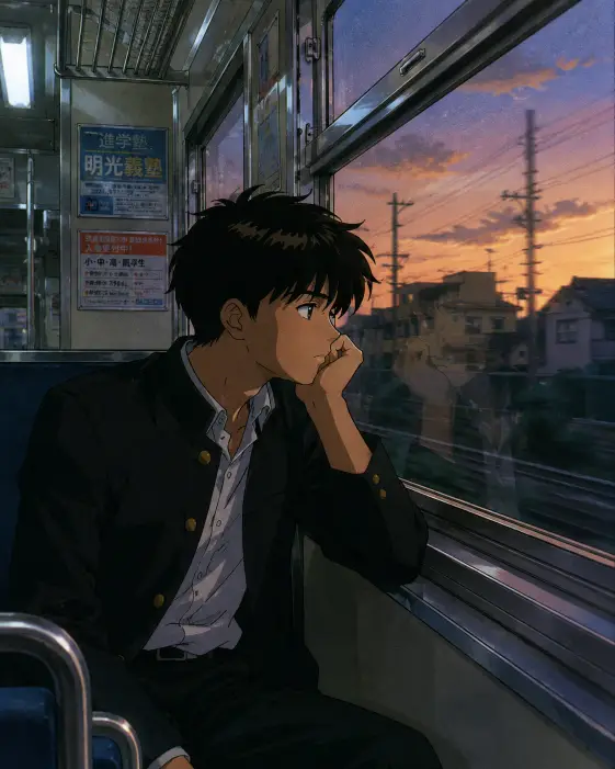
This one makes a quiet character illustration in the style of hand painted anime from about thirty years ago. A boy on an evening train, chin on his hand, watching the suburbs slide past outside the glass.
I keep coming back to it because it does not need a story to work. The mood carries the whole image on its own.
What this prompt is actually asking for
The era instruction is doing the heaviest lifting here. Asking for a retro anime look from that decade pushes the output toward flat color blocks, painted backgrounds, and faces built from a few clean shapes instead of heavy digital rendering. Take it out and you get shiny modern hair and glowing eyes.
The subject is a teenage boy alone on a commuter train. The word alone matters more than it looks. Drop it and other passengers usually show up in the seats behind him, which turns a quiet frame into an ordinary one.
The pose is chin on hand with the elbow propped against the window ledge. That is a slouch, a bored travel posture, and readers pick it up instantly. In an illustration, posture communicates mood faster than the face does.
Clothing is a black gakuran jacket with the collar slightly open and a plain white shirt underneath. The gakuran is the high collared black school jacket from older Japanese school settings, and naming it fixes both the place and the period in two words. The open collar is a small thing, but it stops him looking stiff and posed.
The hair is dark, slightly messy, with one thick highlight stripe. That stripe is a specific old animation shortcut, a solid band of lighter color painted across the hair instead of a soft shine. Ask for it directly or you get smooth modern rendering instead.
The framing and the light
Even though nothing here is a photograph, describing a camera position gives the generator a clear place to stand. Eye level from the seat across the aisle puts the viewer opposite him at the same height as his face, so it feels like sharing the carriage rather than looking down at him.
Three quarter profile means his head is turned partway toward you, somewhere between straight on and a full side view. It is the most forgiving angle for a drawn face, because you still see both eyes plus the shape of the nose and jaw.
Two light sources are named, and the contrast between them is the entire point of the image. Cool overhead fluorescent light is the flat white light of a train ceiling. Warm evening light through the window is the low orange sun. Cold from above, warm from the side, and his face gets shaped by the gap between them.
The faint reflection in the pane is a small request that pays off well. A ghost of his face in the glass adds depth and a bit of loneliness without adding a single new object to the frame.
Hard edged cel shading means shadows land as solid shapes with crisp borders rather than soft fades. That single choice is what makes an image look drawn for animation instead of airbrushed.
The desaturated blue and amber palette keeps everything inside muted blues and warm oranges. Desaturated simply means the colors are pulled back from full brightness, which reads as film rather than screen. Analog film grain lays a light speckle over the top, and thin sharp linework keeps the outlines fine instead of thick and cartoonish.
The 4:5 ratio is the tall shape that fills an Instagram feed post without cropping.
What you will get
Expect a vertical illustration with the boy filling the lower two thirds of the frame, warm light catching one side of his face, and a soft blue and orange smear of suburb outside the window.
The parts that stay steady across runs are the palette, the flat shading, the posture, the uniform, and the general framing. Those instructions are specific enough that they land almost every time.
His face is the least predictable part. He reads anywhere from about fourteen to early twenties depending on the run, so if age matters to you, plan on generating a few and picking.
The reflection in the glass is the other unreliable piece. Sometimes it lands beautifully, sometimes it goes missing, and sometimes it floats slightly off from where his head actually is.
The background outside is a gamble too. I have had rooftops, power lines, rice fields, and once a formless orange blur that honestly still worked.
Ways to change it
Moving the setting is the easiest swap and it keeps everything else intact. For a bus version, change the opening line to read sitting alone at the back of a city bus with his elbow against the window frame, and leave the rest exactly as it is.
Shifting the time of day changes the emotional temperature completely. Replace the lighting line with cold blue early morning light coming through the window while the carriage lights are still on, and the same picture reads as tired rather than wistful. For rain, add rain streaking down the glass with distant city lights blurring behind it, and drop the mention of evening sun so the two do not fight.
For a girl instead, swap the gakuran line for a grey school cardigan over a white blouse with a navy ribbon at the collar, and change the hair line to long dark hair with one thick highlight stripe.
If you want a wallpaper rather than a feed post, change the ratio to 9:16 for a phone screen or 16:9 for a blog header. For the wide version I also add a line saying place him on the left third of the frame with the window filling the right, otherwise the extra width just becomes empty carriage.
A few things worth knowing
Age wording can trip safety filters on some generators, even in a completely harmless scene like this one. If the prompt gets refused, replacing teenage boy with young student usually clears it without changing the result much.
The period instruction sometimes gets ignored on the first run. If the output comes back looking modern, reinforce it by adding hand painted animation cel look with muted print colors right after the style line.
Watch out for stacking too many texture effects. Film grain plus the window reflection plus the blurred background can muddy the face, so if the image comes back soft, drop the grain first and see if it sharpens up.
This is a prompt I use when I want something calm rather than eye catching. It will not stop anyone scrolling, but it holds up as a set, and a run of six of these with different weather and different times of day makes a nice little series.