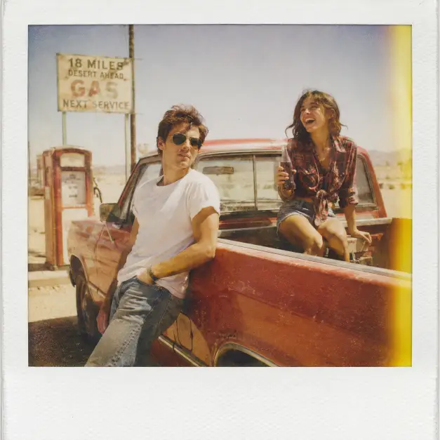
This prompt makes a square snapshot of two people hanging around an old gas station in the middle of nowhere. It reads like a photo somebody took in the late seventies and then forgot inside a shoebox.
I like it because it never tries to look clean. The faded color and the grain are the whole point, so the flaws work in its favour instead of ruining it.
It fits couple photos, road trip posts, retro mood boards, and anything where you want a warm, lived in feel without the picture looking freshly edited.
What this prompt is actually asking for
The first instruction is the format itself. Asking for a vintage Polaroid photograph tells the tool to imitate instant film, which means softer edges, muddier shadows, and colors that sit slightly off from real life. That single line does more heavy lifting than anything else in the prompt.
Then come the two people. The man is leaning on the side of a dusty red pickup, which gives him a relaxed, weight on one leg posture. Leaning is a useful instruction because it stops the figure from standing stiffly in the middle of the frame like a passport photo.
His styling is deliberately plain. Aviator sunglasses, a white tee, and jeans read as period correct without shouting about it, and the sunglasses also solve a problem, since eyes are the part AI images get wrong most often. Covering them removes the most common giveaway.
The woman sits in the open truck bed, which puts her at a different height from him. That height difference is what keeps the composition from looking flat, because two people standing side by side at the same level tends to feel posed.
Her clothing does period work too. Denim cutoffs and a knotted flannel shirt place the photo somewhere between the seventies and eighties, and the knot at the waist gives the fabric a shape rather than letting it hang like a sack.
The glass soda bottle is a small prop doing a big job. It gives her hands something to do, and hands with a purpose come out far better than hands left loose. The laughing instruction matters for the same reason, since a natural expression covers a lot of small errors in a face.
The background is set with a vintage gas pump, a faded station sign, and wide open sky. Those three items are enough to build a whole location without over describing it, and leaving the sign faded means the tool does not have to invent readable text, which it usually botches.
The sun and the film stock
Harsh midday sun is an unusual choice, and it is deliberate here. Most photo prompts ask for golden hour because it flatters people, but midday light is flat, bright, and slightly unkind, which is exactly what an old vacation snapshot looks like.
Harsh light also means short, hard shadows directly under the truck and the people. If you asked for soft light instead, the whole thing would start looking like a modern fashion shoot in costume.
The washed out sky is the second half of that idea. Old film could not hold detail in a bright sky and a shaded subject at the same time, so the sky blew out to near white. Asking for it on purpose is what makes the image feel dated rather than retouched.
Heavy film grain is the speckled texture you see across the whole frame. It is the fastest way to break the smooth, plastic surface that AI images default to, and I would keep it in even if you change everything else.
The sun bleached palette and dusty warm tones push the colors toward faded orange and pale yellow, with the reds sitting duller than they would in real life. That is why the truck is described as dusty red instead of bright red.
The yellow light leak on the right edge is the last touch. A light leak is a streak of stray light that hit the film inside the camera, and putting one along a single edge is a small, believable imperfection rather than a filter smeared over everything.
Shot on expired Polaroid film pulls all of that together. Expired film shifts colors unpredictably and loses contrast, so it gives the tool permission to be inconsistent in the way real old photos are.
What you will get
Expect a square image with the truck taking up a good part of the frame, the two people arranged around it, and a lot of empty sky above. The sky usually looks brighter and emptier than you expect, which is correct for this look.
The parts that stay consistent are the mood, the color treatment, and the general staging. Every run gives you dusty warm tones, a hazy sky, and a couple positioned around a pickup.
The parts that vary are the faces, the exact angle on the truck, and how much of the gas station shows up. Sometimes the pump sits close behind them, sometimes it drifts far off to one side.
The sign is the least reliable element. It may come out blank, smudged, or covered in letters that almost spell something. That is normal for faded signage, so it rarely looks wrong, but do not count on legible text.
Hands around the soda bottle can also go strange. If they do, rerun rather than trying to fix it with more words, because adding hand instructions usually makes the problem worse.
Ways to change it
For a cooler, quieter version, replace the midday line with late afternoon sun low on the horizon, long shadows across the road, and swap the washed out sky for a pale orange sky. The dust stays, but the whole picture calms down.
To move it out of the desert, change the background line to read a small roadside diner with a neon sign and pine trees behind it. Keep the film treatment untouched, since that is what carries the era.
For a single subject, cut the woman entirely and rewrite the man’s line as sitting on the open tailgate with his elbows on his knees, looking off down the road. Solo versions tend to come out cleaner because there is one less face to get right.
If you want the color pushed further, add faded cyan shadows and a magenta cast in the highlights. Expired film often shifts that way, and it makes the image look less like a warm filter and more like real aging.
The square format suits a feed post or a scrapbook style layout. For Stories or Reels, change the ratio to 9:16 and add framed vertically with the truck on the left and the road running out behind it, otherwise the crop tends to cut the vehicle in half. For a blog header, 16:9 works well because the wide sky finally has somewhere to go.
A few things worth knowing
Two people in one frame is harder than one, and the second face is usually the weaker one. Running it a few times costs nothing and the difference between attempts can be large.
Grain and sun bleaching hide small errors, which is one of the quiet advantages of this style. Skin texture that would look odd in a sharp image gets buried under the film texture.
If a run comes back looking too modern, the usual culprit is the truck reading as a recent model. Adding rounded fenders and a chrome front bumper to that line pulls it back to the right decade.
This is a forgiving prompt to play with, so change one line at a time and see what moves. The film treatment is the part I would leave alone.