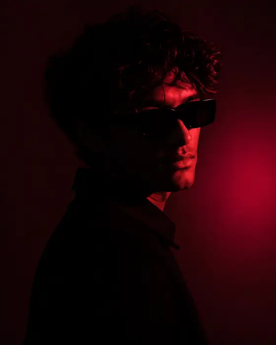
This prompt makes a single portrait of a young man lit almost entirely by one red light, with everything else dropping away into black. It looks like something shot in a small rented studio with one light stand and a sheet of colored plastic clipped over the front, which is exactly the look it is copying.
I use it when I want a profile picture that reads as serious without turning into a corporate headshot. It suits music cover art, moody feed posts, and anything where a face sitting in shadow still needs to hold your attention.
It is also a decent starting point if studio style prompts are new to you. There is only one light source here, so there is only one thing to get right.
What this prompt is actually asking for
The subject is a young man turned in profile with his face angled back toward the camera. Profile means his body is side on, so you would normally see one cheek and one eye. Angling the face back brings both eyes nearer the lens, which stops the shot from looking like a passport photo taken from the wrong side.
The neutral expression is doing real work. A smile fights this kind of lighting, because dark images read as still and quiet, and a grin pulls against that. Asking for neutral directly is safer than hoping for it.
Thick curly dark hair gives the light something to grab. Textured hair picks up a thin red edge along every curl, and that broken edge is a big part of why the image reads as a photograph rather than a flat cutout of a head.
The black rectangular sunglasses do two things at once. They hide the eyes, which pushes the picture toward mood instead of eye contact, and their hard straight edges sit against the round curls above them so the face has some shape even in shadow.
The black collared jacket blending into the background is the part people miss. When clothing matches the backdrop, the shoulders dissolve and the head appears to float in the frame. Put him in grey or white and you would see a full body outline, and the whole effect falls apart.
The camera and lighting choices
Eye level means the lens sits at the same height as his face. No looking down at him, no looking up. It keeps the picture calm and neutral, which is what you want when the lighting is already doing something dramatic.
Shoulders up is a tight crop. You get head, neck, a bit of collar, and nothing else. Tight crops suit low key work because there is less empty black space to fill, and a face fills the frame better than a torso does.
Low key is the term for a photo where most of the frame sits in darkness and only small parts are lit. It is not the same as an underexposed photo. The lit parts stay bright and clean, the rest simply goes black.
The gel is the piece worth understanding. A gel is a sheet of colored film placed over a studio light so the light itself comes out colored instead of white. Asking for a deep red gel from the right side means one hard red beam catches the right edge of his face, jaw, and hair, and everything the beam misses stays dark.
That leftover glow on the wall is spill, the light that misses him and lands behind him. It reads magenta rather than red because red light spreading across a surface tends to look pinker than the beam itself. That patch of magenta stops the background from being a flat black void and gives the head something to sit against.
Crimson, magenta, and black as a palette keeps skin from turning natural. Expect skin that reads as red, not as tanned skin under a red lamp. That is the intended look here.
The 4:5 aspect ratio is a tall rectangle. It is the largest shape an Instagram feed post can occupy, so the image takes up more screen as someone scrolls past.
What you will get
Most runs land on the same basic image. A dark frame, one face lit down its right edge, sunglasses catching a hard red reflection, curls rimmed in light, and a soft magenta patch on the wall behind.
The face is where results vary. Age drifts anywhere from late teens to early thirties, and features change run to run because the prompt never describes them. If you need one consistent person across several images, you will need to add descriptive detail or work from a reference photo.
Hair volume varies too. Sometimes the curls are tight and close, sometimes they are large and loose enough to read as an afro. Both look fine, they just are not the same picture.
The honest weak spot is exposure. Some runs come out lit more than asked, with the face fully visible and the shadow side barely dark at all. If that happens, adding words like most of the frame in complete darkness usually pulls it back.
Ways to change it
For a cooler version, replace the red gel line with a single deep blue gel light from the left side, and change the palette line to cobalt, teal, and black. Same structure, completely different feeling, and blue tends to hold facial detail slightly better in shadow.
For a split lighting look, ask for two gel lights, one deep red from the right and one blue from the left, with the center of the face in shadow. That is the standard two color portrait you see on album covers, and it gives you color on both edges instead of one.
To bring the eyes back, drop the sunglasses and write instead looking directly at the camera with a steady expression. The image gets more confrontational and less anonymous.
For Reels or a phone wallpaper, change the ratio to 9:16 and add more headroom above the hair so the crop does not cut into the curls. Square 1:1 also works if you keep the tight shoulders up framing.
A few things worth knowing
Deep red lighting sometimes trips safety filters on stricter tools, usually because heavy red on skin can read as something it is not. If a run gets blocked, softening deep red to warm red and swapping near total shadow for soft shadow normally clears it without changing the look much.
Aspect ratio wording is not universal. Some tools want the phrase spelled out, some want a flag at the end, and some ignore it entirely and give you a square. Check how yours handles it before assuming the prompt failed.
One last thing. This look depends on the background being genuinely dark. If your output has a grey wall behind him instead of black, add plain black studio backdrop and the contrast comes right back.