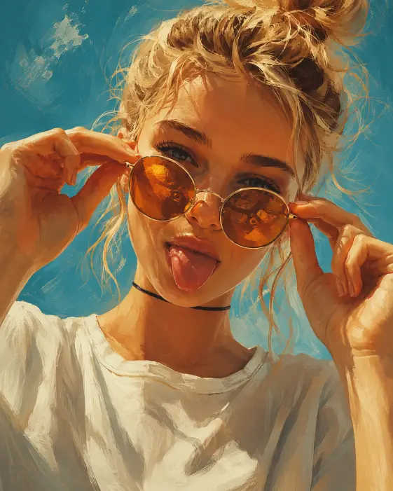
This one makes a close up painted portrait of a young woman tugging her round amber sunglasses down her nose while sticking her tongue out. It lands as fun rather than serious, and the painted finish keeps it from pretending to be a photo.
I reach for prompts like this when I want a profile picture or a feed post with some personality in it. A straight portrait prompt gives you a nice face. This one gives you an attitude.
The whole thing rests on two ideas working together, a silly gesture and a painting style loud enough to carry it.
What this prompt is actually asking for
The subject description is doing less work here than you might think. A young woman with blonde hair in a loose messy bun is fairly open, so the face you get is largely improvised. That is fine, because the gesture is what makes the image, not the specific person.
The messy bun matters more than it looks. Asking for strands escaping around her temples stops the hair from reading as neat and salon finished, which would fight the playful expression.
Pulling the sunglasses down with both hands is the hinge of the whole picture. One hand would read cool and casual. Two hands reads childlike and a bit goofy, and it also brings both forearms into the frame near her face, which fills the lower corners and frames her chin.
The tongue out is the second half of that joke. Keep both or drop both. A tongue out with no hands on the glasses feels random, and hands on the glasses with a neutral mouth turns the image into a fashion shot.
Amber tinted round lenses are pulling double duty. Amber warms anything reflected in the glass, and round frames carry a retro feel that suits the painted style. The tint also keeps her eyes partly visible behind the lenses instead of hidden behind mirrored black.
The loose white oversized t shirt keeps the color story simple. White bounces daylight back up onto her chin and jaw, so the lower half of the face stays bright. A dark top would absorb that light and make the whole image heavier.
The thin black choker is a small accent, but it gives the eye a place to land between pale fabric and skin. Small dark details like this stop a bright picture from looking washed out.
The camera angle and the light
Very close and slightly below the face is a specific combination worth understanding. Slightly below means the camera sits a little under her chin line and tilts up, which makes her feel close and a bit larger than life instead of being looked down on.
Cropping the top of her head sounds like a mistake, and it is not. Cutting the crown pushes her eyes and mouth toward the middle of the frame and makes the shot feel grabbed at arm’s length rather than carefully posed.
Bright daylight across the cheeks asks for hard open sunlight, not soft indoor light. That gives you strong highlights along the cheekbones and the bridge of the nose, with short crisp shadows under the chin and the hands.
The warm reflections in the lenses is a tiny instruction with a big payoff. Reflections give the glass depth, so the sunglasses look like real lenses instead of flat orange circles pasted on her face.
The teal blue sky is a color decision more than a location one. Teal sits roughly opposite amber on the color wheel, so the cool background pushes against the warm skin and lenses and makes both look stronger. The soft cloud texture just keeps that background from going flat and empty.
Painterly digital illustration with visible brush strokes is the finish. It means you should be able to see the paint, with edges that are slightly rough and colors that sit in patches rather than blending perfectly. Rich saturated color pushes the teal and amber further apart.
What you will get
The composition holds up well run after run. You will reliably get a tight face, the glasses low on the nose, hands in frame, bright light, and a teal background.
The face is the part that changes most. Every run gives you a different young woman, so if you want a consistent character across several images you will need to add specific features like a round face, freckles, or a strong jaw.
The hands vary a lot too. Sometimes both hands grip the frame neatly at the temples, sometimes the fingers land in odd places. The bun shifts around, the tongue ranges from a small cheeky peek to a full stretch, and the brush texture can come out anywhere from thick and chunky to almost smooth.
The 4:5 ratio is a tall rectangle. It fills more of a phone screen than a square does, which is why it suits a feed post.
Ways to change it
For a softer, warmer version, replace the lighting and background lines with late afternoon golden light falling across her face and a warm peach sky behind her. You lose the punchy contrast, but you gain a nostalgic film poster feel.
For a cooler, moodier take, change the lenses to blue tinted round sunglasses and swap the background to a plain lavender wall. The image goes calmer straight away because nothing warm is left to fight the cool tones.
If the crop feels too tight, change the camera line to a chest up shot at eye level with her whole head inside the frame. You lose some of the snapshot energy, but you get room for the oversized shirt to actually read as oversized.
To change the finish, replace the style line with flat vector illustration with bold outlines and limited color for a sticker look, or soft watercolor illustration with visible paper texture for something gentler.
For platform fits, use 1:1 for a square post, 9:16 for a story or a vertical video cover, and 16:9 if you want it as a wide header.
A few things worth knowing
Hands near the face are the weak point of this prompt. Fingers can come out fused, bent oddly, or with an extra one attached. If two hands keep failing, cut it back to one hand pulling the glasses down and rest the other arm out of frame.
The tongue can also go wrong and come out too large or oddly shaped. Writing a small playful tongue out expression with her mouth mostly closed usually keeps it under control.
The head crop instruction gets ignored sometimes. If the full head keeps showing up, be blunter and say the top of her head is cut off by the top edge of the frame.
If the painted look comes out too clean, push it with thick visible oil paint strokes and slightly rough edges. If it comes out too rough and the face loses detail, dial it back to smooth painterly rendering with soft brush strokes.
I like this prompt because it is forgiving. Even when the hands misbehave, the color pairing and the tight crop carry the image far enough that a rerun or two usually gets you something worth keeping.