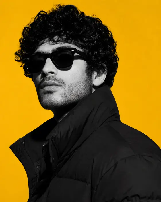
This prompt makes a magazine cover style headshot. A man in dark sunglasses and a puffer jacket, rendered in grey tones, sitting flat against a loud yellow wall.
The split between a colorless subject and a fully saturated background is the whole trick. It is a graphic design move more than a photography one, and it holds up at small sizes, which is why it works well as a profile picture or a feed post.
I like this one because it is specific enough to stay predictable. Most of the important elements are locked down in the wording, so runs tend to look like siblings rather than strangers.
What this prompt is actually asking for
The subject is described with two physical details, thick curly black hair and light stubble. Both are there for texture. Curls catch the light in a hundred small places, and stubble gives the jaw a visible surface, which matters because the jaw is exactly where the shadow lands.
Three quarter profile means the head is turned about halfway between facing the camera and facing the side wall. It keeps the nose and the jawline readable as shapes instead of flattening the face into a passport photo. If you drop this line, you usually get a straight on shot, which is much duller here.
The lifted chin is doing attitude work. A chin tipped up reads as confident, sometimes a little cold, and it stretches the neck line so the collar has something to wrap around.
Squared shoulders turned away from the camera means the body points one direction while the head turns back toward the lens. That small twist is what stops the pose from looking stiff. Body and face aiming the same way tends to look like an ID card.
The black wayfarer sunglasses are a specific frame shape, thick and angular with a slight upward flare at the corners. Naming the shape matters, because just writing sunglasses leaves the choice open and you may end up with thin wire aviators, which change the mood completely.
The puffer jacket with a tall popped collar does two jobs. It fills the lower half of the frame with a bulky black shape, and the collar closes in around the neck so the face sits inside a frame. Without the popped collar the composition loosens up and the shoulders start to sprawl.
Chest up framing keeps everything tight. You get head, collar, and a little jacket, and nothing else competes for attention.
The camera and lighting choices
Eye level means the lens sits at the same height as the face. No looking down, no looking up. It reads as a person meeting your eye, which is the neutral choice and the right one for an editorial portrait.
The lighting line asks for crisp directional light from the left. Crisp means hard light, the kind that comes from a small or bare source and cuts a clear edge between lit and unlit skin. Soft light does the opposite and wraps around the face with barely any shadow border.
Hard light is the reason the prompt specifies defined shadows along the jaw. One side of the face stays bright, the other drops into grey, and the line between them is sharp. That contrast is most of what makes the image feel like a shoot rather than a snapshot.
The side the light comes from is worth keeping in mind. Left side lighting combined with a head turned in three quarter profile means the light either rakes across the face or catches the far cheek, and both look good, though they are different pictures.
The background is described as flat and solid, which means no gradient, no visible corner where a wall meets the floor, and no shadow cast onto it. That flatness is what makes the yellow behave like a printed panel instead of a room.
Mustard yellow is a specific choice. It is warmer and dirtier than a school bus yellow, and it sits nicely against grey skin tones without vibrating.
The aspect ratio of four to five is the tall rectangle that fills the most space on an Instagram feed. It also suits a chest up portrait, since the frame is taller than it is wide and the face has somewhere to sit.
What you will get
The parts that stay reliable across runs are the color split, the yellow field, the tight framing, the sunglasses, and the general shape of the pose. That is a lot of consistency for a single paragraph of text.
The parts that wander are the face itself, the exact shade of yellow, how much jacket ends up in frame, and how heavy the jaw shadow lands. Sometimes the shadow is a soft grey edge, sometimes it is nearly black.
Reflections in the sunglasses are a coin flip. You may get clean dark lenses, or you may get a faint studio light bouncing back at you. Both are fine, but if you want one specifically, ask for it.
The stubble is often the first detail to go missing. If it matters to you, push on it with wording like a few days of visible stubble across the jaw and upper lip.
Ways to change it
The background color is the easiest swap and the one that changes the mood most. Replace the mustard line with a solid deep teal background, or a solid warm terracotta background, and the same portrait suddenly feels calmer.
To soften the whole thing, change the lighting sentence to soft diffused studio lighting from the left with gentle shadows along his jaw. You lose the hard editorial edge and gain something more like a beauty campaign.
For a warmer, less severe subject, drop the sunglasses and lift the chin less. Try turned in three quarter profile with his chin level and a calm direct gaze, which gives you an actual face to connect with.
If you want the reverse of the color trick, ask for the subject in full natural color against a flat black and white striped background. It is a different graphic idea using the same structure.
For platform fit, change the ratio line. Square works for a grid tile, nine to sixteen fills a Reel or a Story with a lot of empty yellow above the head, and sixteen to nine turns it into a wide banner where you should ask for the subject positioned to the right of frame so the yellow has room.
A few things worth knowing
The greyscale subject on a color background is the part most likely to misfire. Some runs desaturate the whole image, background included, and some tint the skin slightly yellow from bounced light. Running it again usually fixes it, and adding the subject remains completely monochrome with no color tint helps.
Flat mustard is hard to pin down exactly, so if you need a specific shade for a brand or a series, name a hex value in the prompt and check the result rather than trusting it.
Wayfarer is a trademarked frame name and occasionally gets ignored. Thick angular black plastic sunglasses is a safe fallback that describes the same look.
Nothing here is likely to trip a safety filter. It is a clothed portrait with no brand logos beyond the frame style, so it should run clean.
This is one of those prompts I keep coming back to because the structure survives almost any change you make to it. Swap the color, swap the jacket, swap the person, and it still looks like it belongs on a cover.