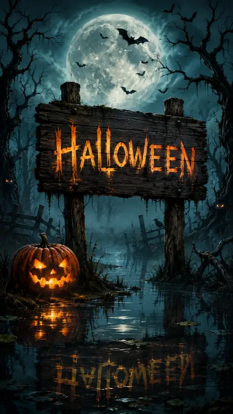
This one makes a vertical Halloween picture with a wooden sign as the main character. Everything else in the frame, the pumpkin, the moon, the bats, the water, exists to make that sign feel like it has been standing in a swamp for fifty years.
I like it because the word Halloween is built into the artwork itself. You get a title card and a scene in the same image, which saves you from slapping text on top later.
It suits Reels covers, Story posts, phone wallpapers, and pinned images. If you run a seasonal account or you just want a header for a Halloween post, this is the shape you want.
What this prompt is actually asking for
The subject is a weathered wooden signboard. Weathered is doing real work there. It tells the generator to add cracked paint, split grain, and a leaning post instead of a clean new plank that looks like a hardware store sample.
The word Halloween is described as hand painted in glowing orange letters. Hand painted keeps the lettering slightly uneven, like a person did it with a brush, which fits the setting better than a crisp font. Glowing means the letters carry their own light rather than being lit from outside.
The misty swamp sets the ground and the air at once. Mist gives you soft edges in the distance and that milky haze near the water, and it also hides the horizon so the scene feels enclosed.
A carved jack o lantern sits on the bank to the left. Placing it on one side matters, because it keeps the sign centered and gives the picture a second point of interest instead of a symmetrical layout that reads flat. The warm light in its eyes is the small detail that makes the pumpkin look alive rather than like a prop.
Small bats fly across a huge pale full moon behind the sign. The moon is the brightest shape in the frame, so it acts as a backdrop that separates the dark sign from the dark sky. Without it, the sign would sink into the background and the whole image would go muddy.
Twisted bare trees frame both sides. Framing means dark shapes at the left and right edges that push your eye toward the middle. Bare and twisted also removes leaves, which keeps the silhouette sharp and creepy instead of soft and green.
Glowing eyes peeking from the shadows is a cheap trick that works every time. They add the feeling that something is watching without showing a creature, so your brain fills in the rest.
The lighting and composition choices
Straight on at eye level means the viewpoint sits at the same height as the sign, looking directly at it. You are standing in the swamp, not floating above it. A high angle would have made the scene feel like a map, and a low angle would have made the sign look heroic and huge, which is the wrong mood.
The reflection in the dark still water is the strongest part of this prompt. Still is the key word. Still water acts like a mirror, so the orange letters and the pumpkin light double themselves in the lower half of the frame and the picture gains depth for free.
The color palette is cold teal and slate blue against warm orange highlights. This is the standard horror pairing, and it works because cold and warm colors sitting next to each other make each other look stronger. The teal and slate cover the sky, mist, trees, and water, and the orange is limited to the letters and the pumpkin, so the eye goes exactly where you want it.
Detailed digital illustration with a storybook horror feel is the style instruction. Storybook horror means spooky but not gory, closer to a children’s picture book at night than a horror film poster. It keeps shapes a little rounded and stylised instead of photoreal.
The 9:16 aspect ratio is a tall vertical, the same shape as a phone screen. It stacks the moon at the top, the sign in the middle, and the reflection at the bottom, which is why the layout in this prompt works so well vertically.
What you will get
Expect a moody vertical picture with a strong blue green cast, a big pale moon disc, a leaning sign carrying orange letters, and a bright reflection underneath.
The parts that stay consistent are the color scheme, the vertical stacking, the reflection, and the pumpkin on the left. Those are described clearly enough that they show up almost every run.
The lettering is the part that varies most. Text inside generated images is still the weakest area across the board, so you may get a wobbly letter, a doubled letter, or something that reads Hallowen. I usually run it a few times and pick the cleanest one rather than fighting it.
The glowing eyes also come and go. Sometimes you get two subtle dots in a tree line, sometimes you get five pairs scattered everywhere, and sometimes none at all.
Bat count is unpredictable too. Small bats is vague on purpose, so you might get three or thirty.
Ways to change it
If the lettering keeps breaking, shorten the word. Change that line to read with the word BOO hand painted across it in glowing orange letters. Fewer letters means fewer chances to fail.
For a graveyard instead of a swamp, replace the misty swamp with a misty graveyard with leaning headstones, and swap the reflection line for a low ground fog rolling between the stones. You lose the mirror effect, so add wet cobblestones catching the orange light if you want something similar back.
For a warmer, friendlier version, change cold teal and slate blue to deep purple and midnight blue, and change storybook horror to storybook Halloween. That takes the edge off without losing the season.
To fill a blog header instead of a phone screen, change the ratio line to use aspect ratio 16:9. Move the moon off to one side in your wording, since a tall stack does not fit a wide frame. Try with the full moon low on the right and the sign standing left of center.
For a square post, ask for 1:1 and pull the trees in tighter so the framing still reads at that width.
A few things worth knowing
Dark scenes tend to come out darker than you expect on a phone screen. If yours looks like a black rectangle, add faint moonlight catching the mist and the top edge of the sign to your prompt and it will lift.
Nothing here trips safety filters. Glowing eyes and bats are tame, and the storybook framing keeps it far away from anything graphic.
If the reflection looks blurry rather than mirrored, push it harder by writing a sharp mirror reflection of the sign and pumpkin in the glassy black water.
I would run this one at least four times before picking. The composition lands almost every time, but the sign text is a lottery, and one good letter run is worth the extra attempts.