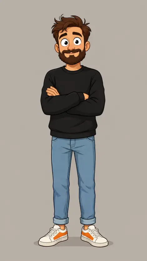
This one makes a single cartoon person standing alone on a plain background, drawn head to toe. Think character sheet, or the little avatar people stick on an about page.
I keep coming back to it when I want a friendly mascot that looks hand drawn but stays consistent. There is no scene to get wrong, so the output usually lands close to what you asked for.
It suits anyone who needs a person illustration without an environment around them. Website avatars, sticker sets, slide deck characters, app onboarding screens.
What this prompt is actually asking for
The subject is a bearded man in his thirties. Stating the age matters more than people expect. Leave it out and the face drifts young, closer to a college student, and the beard ends up looking pasted on.
Full body is the other load bearing instruction. It tells the generator to fit the whole person into the frame with the feet included. Drop it and you usually get a waist up crop, because most illustration reference leans that way.
The pose is standing straight with the arms crossed over the chest. Crossed arms quietly solve the hardest problem in character art, which is hands. Tucking them against the body hides most of the fingers and cuts down on the melted hand look.
The expression is a closed lip smile described as slightly awkward. That one word is doing real work. A plain smile gives you a stock mascot face, while awkward pulls the mouth smaller and slightly uneven, which reads as a person instead of a logo.
Then the head details: short messy brown hair with one tuft sticking up, big round eyes, thick brown beard. The stray tuft is the kind of small thing that makes a character look drawn on purpose rather than generated. Big round eyes push the whole style toward friendly cartoon instead of realistic.
Clothing is listed piece by piece, and that is why the outfit comes out stable. A loose black long sleeved sweatshirt, light blue jeans rolled at the ankle, white sneakers with orange side panels. The orange is the only strong color in the picture, so it becomes the spot your eye lands on.
Rolled jeans matter more than they sound. Rolling the cuff exposes the ankle and separates the leg from the shoe, so the sneakers stay readable instead of blending into the denim.
The framing and lighting choices
The camera line asks for straight on at full height. Straight on means the viewpoint sits level with the middle of the body rather than looking down or up, so the proportions stay honest and nothing gets squashed.
There is also a small soft shadow under the feet. Small instruction, big effect. Without it the character floats, and the picture looks like a sticker dropped onto grey. That shadow anchors him to a floor that was never drawn.
Flat even lighting with no strong shadows keeps the shading simple. In illustration terms that means no dramatic light from one side and no dark half of the face, just steady tone across the figure.
That matches the style line, which asks for clean western cartoon illustration with bold outlines and simple flat shading. Bold outlines are the thick dark lines drawn around each shape. Flat shading means every area gets one or two solid tones instead of a smooth gradient.
The background is plain warm grey with nothing else in frame. Warm grey rather than pure grey is deliberate, since neutral grey turns cold and clinical next to skin tones. An empty background also makes the figure easy to cut out later.
The aspect ratio is 9:16, a tall vertical frame. That fits a standing full body figure well, because a wide frame would leave big empty gaps on both sides of him.
What you will get
A friendly looking cartoon man centered in a tall grey frame, drawn with clean outlines and flat color, arms folded, feet planted.
The reliable parts across runs are the outfit colors, the crossed arms, the aspect ratio, the empty background and the flat style. Those are stated plainly enough that they hold up.
The parts that wander are the face and the beard length. Sometimes the beard comes out short and neat, sometimes it reaches the collarbone. Eye size swings too, from mildly large to very cartoonish.
The awkward smile is the least predictable piece of the whole thing. Maybe half my attempts land it, and the rest give a confident neutral smile instead. If you want awkward, running it a few more times is easier than rewording it.
Feet and shoes are the usual weak spot in full body illustration. Watch the sneakers, because the orange panel sometimes lands on the wrong part of the shoe or smears across the toe.
Ways to change it
For a different build, add a line about body shape, something like a tall thin build with narrow shoulders, or a stocky build with a round face. The prompt says nothing about body type right now, so you get an average build every time by default.
To change the pose, replace the crossed arms line with one hand in his pocket and the other raised in a small wave. Keeping one hand hidden keeps the hand problem manageable.
For a warmer palette, swap the top to a mustard yellow hoodie with the sleeves pushed up, and drop the orange sneaker panel to plain white. That moves the accent color from the feet up to the chest, which changes where the eye goes first.
If you want a chunkier sticker look, change the style line to bold black outlines with heavy line weight and two tone flat shading.
For other platforms, 4:5 works for a feed post and leaves a little breathing room around the figure, 1:1 crops tight and usually cuts the shoes off, and 16:9 only works if you add something beside him to fill the width.
A few things worth knowing
Full body prompts and lettering do not mix. If you put a slogan on the sweatshirt, expect scrambled letters at this size, because the text ends up tiny inside the frame. A plain chest is safer.
Nothing here should trip a content filter. It is a clothed adult standing in a neutral pose, about as safe as an image prompt gets.
The setting I change most often is the age. Thirties works fine, but forties with light grey at the temples gives a noticeably different character, and often a more interesting one.
If you plan to use him more than once, save the exact wording you settle on. Character consistency across separate runs is hard, and matching your own earlier prompt word for word is the closest thing to a trick that works.