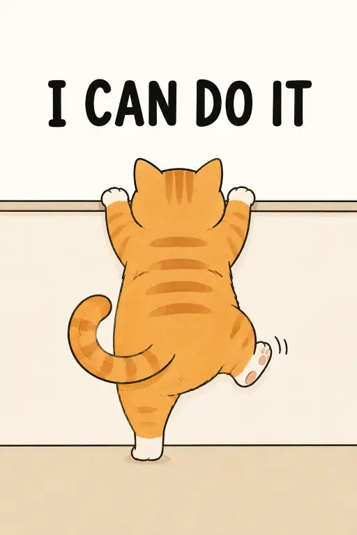
I keep coming back to this one because it does so much with so little. A round orange cat, seen from behind, stretching up toward a ledge it probably cannot reach, with three stubborn words sitting above it.
It suits anyone who wants a small, cheerful piece of art without a busy scene. Phone wallpaper, a sticker, a nursery print, a card for a friend who is having a rough week.
This is an illustration prompt rather than a photo prompt, so there is no camera, no lens, and no lighting rig to talk about. What carries the image instead is line weight, flat color, and how much empty space gets left around the cat.
What this prompt is actually asking for
The subject line is doing three jobs at once. It names the animal, gives it a body shape, and points it away from the viewer.
Chubby matters more than it sounds. A slim cat drawn in the same pose reads as athletic and slightly tense, while a round one reads as sweet and a little hopeless, which is the whole joke.
Seen from behind is the smartest line in the whole thing. Faces are where cute animal illustrations usually fall apart, with mismatched eyes or a strange smile, and turning the cat around removes that risk completely. It also adds feeling, because a back view makes the viewer watch someone struggle rather than pose.
Standing on hind legs and stretching upward is the action. Without that phrase you get a cat sitting politely beside a ledge, which is a different and much duller picture.
The curled tail and the one kicking back paw are small motion cues, and they earn their place. Two flat paws and a straight tail freeze the drawing, while a kick and a curl suggest the cat is mid effort and wobbling.
Calling the ledge low keeps it small and close to the cat. Drop that word and the ledge often grows into a full wall or a countertop that swallows the composition.
The words above the cat
The text is set in bold black uppercase, and both halves of that matter. Bold gives it weight against a pale background, and uppercase keeps the letter heights even so the line sits like a block rather than a wobble.
I will be honest here. Text is the least reliable part of any image prompt, and short phrases like this one still come out with a doubled letter, a missing letter, or odd spacing. I usually run it a few times and keep the clean one, or I generate the art with the space left empty and add the words myself afterward.
Why the flat straight on view matters
Straight on with no perspective means nothing recedes into the distance. There is no vanishing point, no angled ledge, no sense of depth, so every shape sits on the same plane like a sticker.
Take that line out and you often get a three quarter view with a cast shadow under the ledge. It looks fine, but it stops being minimal and starts being a small scene.
The plain off white background does the same kind of work by subtraction. Nothing behind the cat competes with the outline, which is what keeps the shape crisp.
The beige floor line is a single horizontal band near the bottom. It gives the cat somewhere to stand, and without it the whole figure floats in blank space and looks unfinished.
The line and color choices
Soft cute line art with clean outlines means a steady dark line around every shape, roughly the same thickness all the way round. It is the look of a sticker or a children’s book rather than a sketch.
Flat color fills means each area is one solid color with no shading and no gradient. The cat’s belly will not be darker than its back, and that flatness is what makes the image print well and scale down cleanly to an app icon size.
A light cream palette pulls everything toward warm, low contrast tones. The orange stays soft rather than neon, the floor stays sandy, and the black text ends up as the only sharp note in the picture.
What you will get
Across runs, the parts that hold steady are the composition, the back view, the pale warm mood, and the floor line. Those come from clear instructions with little room to drift.
What varies is the small stuff. Stripe patterns change, the tail curls tighter or looser, and the cat sometimes clears the ledge by a good margin and sometimes barely reaches it.
The two failures I see most often are a cat drawn too small inside a lot of empty space, and a ledge that reads more like a table or a step. Both are easy to fix by rerunning rather than rewording.
The 2:3 shape gives you a tall frame with the words at the top and the cat filling the lower two thirds. It maps neatly onto standard print sizes like 4×6 and 8×12, which is handy if this is heading for a frame.
Ways to change it
The words are the fastest swap. Replace them with ALMOST THERE, ONE MORE TRY, or KEEP GOING, and keep the phrase short, since longer lines break more often and shrink the letters.
The animal is the next easiest change. Ask for a grey British shorthair, a small brown dachshund, or a fluffy white rabbit, and the rest of the prompt still works without touching anything else.
To shift the mood cooler, change the palette line to read soft sage green background with a pale grey floor line, and change the cat to a grey tabby so it does not fight the greens.
For platform fit, use 4:5 for a feed post, 9:16 for stories or a phone wallpaper, and 1:1 if you want a square sticker with tighter margins around the cat.
A few things worth knowing
Nothing in this prompt bumps into content filters, so you can run it freely and change the animal or the phrase without trouble.
If the outlines come out too thin for stickers or print, add a line asking for thick uniform outlines. Thin lines look elegant on screen and vanish on paper.
I like this prompt most when I leave it plain. The temptation is to add a butterfly, a plant, a second cat watching, and every one of those additions makes the picture a little less funny.